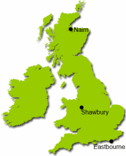
What's the Weather Like?
With access to weather station data, what interesting questions can you investigate?
Problem
Secondary data is data that has already been collected so you do not have to collect it for yourself. Weather data is easily available and there are lots of interesting questions to explore, making comparisons over time and space.

Here is a spreadsheet containing weather data for Shawbury, Eastbourne and Nairn.
What questions or hypotheses can you come up with, that this data could help you to answer?
What analysis will you need to do to test your hypotheses?
Here are some aspects to consider:
You could compare data from the three different weather stations.
You could compare different months of the year, or different seasons.
You could look for trends over time - how has temperature or rainfall changed over the years?
Write up a report on your investigations, including your hypothesis, data analysis and conclusions.
Getting Started
If you are not familiar working with Excel or an equivalent spreadsheet program, you may find these help sheets useful:
Bar Chart Help
Averages Help
Averages, Quartiles and Spread Help
Scatter Diagrams and Correlation Help
Student Solutions
H and J investigated the hypothesis that Eastbourne has, on average, more hours of sunlight than Shawbury here.
Hannah and Georgina investigated the hypothesis that February is the wettest month of the year here.
Chloe from Twynham investigated whether winters in Eastbourne had got warmer since 1959 here.
Harry from Twynham investigated the hypothesis that the average number of hours of sunlight is increasing here.
Jordan and Ella from Twynham investigated the hypothesis that in January, the further south you are, the more hours of sunlight there will be here.
Rhiannon investigated the hypotheses that towns in the west are wetter than those in the east, and that Spring is the wettest season. You can see her investigation here.
Lots of great investigative work here - well done everyone! There's lots of other things you could still investigate.
Teachers' Resources
Why do this problem?
This task involves data from Shawbury, Eastbourne and Nairn weather stations, intended to be used for statistical projects that require the use of spreadsheets. The data sets are ideally suited to testing hypotheses that make comparisons over time or between different places.
It might be a good task to undertake collaboratively with Geography, Science or ICT.
Possible approach
This problem is based on some resources created by Don Steward.
Students will need access to the weather data spreadsheet, containing weather data taken from the Met Office website.
Don's PowerPoint presentation shows the Handling Data cycle and suggests some possible lines of inquiry together with prompts for each stage of the cycle, so could be used to introduce this activity.
Students will need some basic familiarity with working in Excel or an equivalent spreadsheet program. Don produced some help sheets that you may wish to make available to your students:
Bar Chart Help
Averages Help
Averages, Quartiles and Spread Help
Scatter Diagrams and Correlation Help
Possible support
Here is some data on average temperature for various cities. This could be used to practice drawing and then comparing bar charts. It is interesting to see how much warmer the UK is than other places of similar longitude - this is where collaboration with Geography and Science departments might be fruitful.
Here are some extra slides including some graphs and examples of analysis.
Possible extension
Students should aim to use the most sophisticated data handling techniques that they can. The worksheet above on Averages, Quartiles and Spread includes some brief discussion of the standard deviation, which students could research further. By using insights from the Geography and Science lessons, students could suggest reasons for some of their findings.
