Which Spinners?
Can you work out which spinners were used to generate the frequency charts?
Problem
Which Spinners? printable sheet - bar graphs
In the interactivity below there are two spinners.
When you press "One spin", the computer spins them once and adds the numbers. (You can also change the settings so that it finds the difference between the numbers instead.)
You can also spin 100 or 500 times at once. The interactivity records the results in the relative frequency chart.
Warning - the computer needs a little bit of thinking time to do 500 spins!
Experiment with different pairs of spinners.
What features do you notice on the bar charts that you produce?
Can you come up with ways of predicting what a chart will look like before you produce it?
The challenge
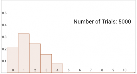
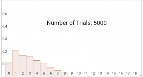
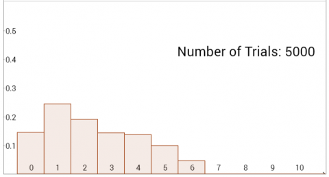
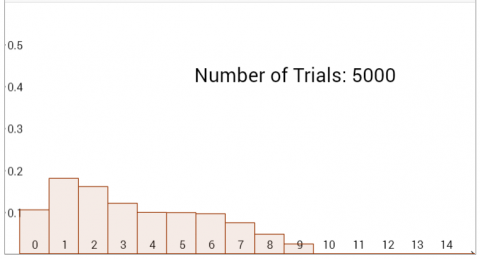
The bar charts below were generated on the interactivity using different combinations of spinners.
Can you deduce which spinners were used to create each bar chart?
Can you explain how you used the information provided by the bar charts to work it out?
(You can download all eight bar charts here, or click on each chart to see a bigger version)
Final challenge
Imagine you had 1-20 and 1-30 spinners. Describe in as much detail as you can what the relative frequency bar charts would look like for:
- The sum of two 1-30 spinners
- The difference between two 1-20 spinners
- The sum of a 1-20 and a 1-30 spinner
- The difference between a 1-20 and a 1-30 spinner
Try to provide a good explanation to convince us that your descriptions of the bar charts are correct.
This resource is part of the collection Statistics - Maths of Real Life
Getting Started
What similarities can you see between the bar charts? What differences can you see?
For each bar chart, what does the minimum and maximum value tell you?
Student Solutions
Well done to Navjot from Sherborne Qatar, who sent in a full solution:
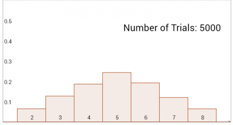
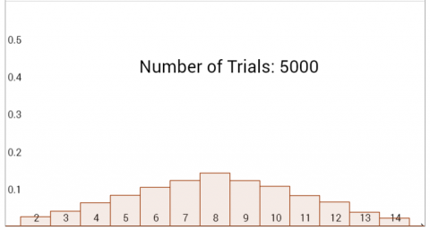
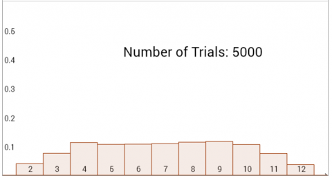
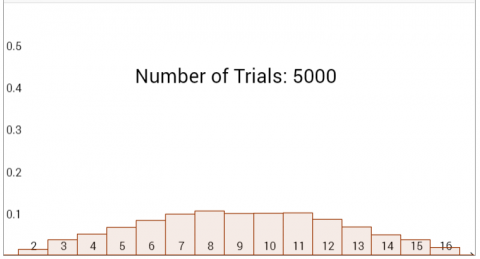
I will firstly divide the given bar charts into 2 groups. Graphs A, B, C, and D are made by the sum of the values on the spinners and graphs E, F, G, and H are made by the difference of the values of the spinners.
We know this because of the fact that the x-values of the first 4 graphs start with 2 while the last 4 graphs start with a 0.
Now, I shall determine the spinners used to make these frequency graphs.
Each graph seems to be a sum or a difference of two even or two odd numbers but not an even and an odd number since the final x-value is an even number.
I assume that the spinners are fair (as we will see, the probability of the sums shown on the graph are extremely close to the calculated probability, which is bound to happen after 5000 spins, if there would still be an imbalance in the probability of getting certain values then the spinners would definitely be biased).
As shown in the images, in the case of graph A, the only possible pairs we could use to get a maximum sum of 8 are 1 & 7, 2 & 6, 3 & 5, or 4 & 4. Through the table, I have shown what is the chance getting a certain sum. The numbers shown on each spinner are shown in blue at the left and bottom of the table, and the sums are shown in black inside the table.
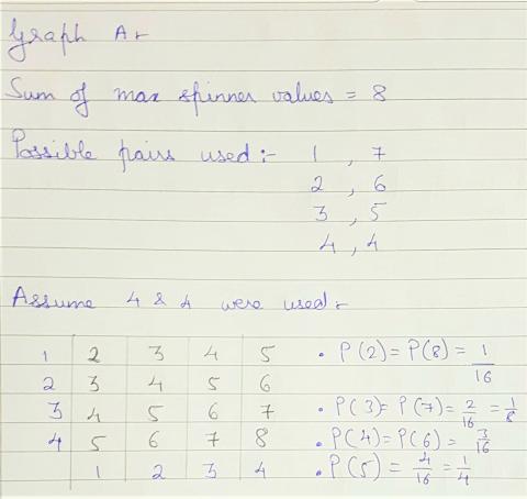
There are 16 black numbers in the table, so 16 possible pairs of numbers on the spinners. Of the sums, 2 only appears once (because to get a sum of 2, you would have to get 1, 1). So the probability of getting 2 is $\frac1{16}$. However, 3 appears twice (1+2 and 2+1) and 4 appears 3 times (1+3 and 2+2 and 3+1), so the probabilities of getting 3 and 4 are $\frac2{16}$ and $\frac3{16}$ respectively.
Through trying the combinations, we would notice that as the difference between the maximum values of the two spinners decrease, the probabilities of getting certain sums start to decrease at a different rate to others (which would create that peak in the graph rather than the plateau). If we were to graph the results, the graph A would most resemble the results of the spinners with the maximum values 4 and 4.
Using that logic (that the smaller the difference between the values, the more the graph would represent the normal distribution curve) [that is, that when the spinners both have the same numbers, the graph goes smoothly up and then smoothly down, peaking in the middle] I deduced that graph B was made by using the spinners with the highest values 7 and 7.
However, in graph C and D, we notice a plateau. This suggests that the top values of the two spinners were not equal. For graph C, I shall assume that the probabilities to get any sum between 4 and 10 are equal (since the variation is negligible), and for D, I shall assume the probabilities to get anything between 7 and 11 are equal.
Applying the same method as I used to find the values used in graph A and B, I find out that the spinners used in graph C went up to the values 3 and 9.
| 1 | 2 | 3 | 4 | 5 | 6 | 7 | 8 | 9 | |
|---|---|---|---|---|---|---|---|---|---|
| 1 | 2 | 3 | 4 | 5 | 6 | 7 | 8 | 9 | 10 |
| 2 | 3 | 4 | 5 | 6 | 7 | 8 | 9 | 10 | 11 |
| 3 | 4 | 5 | 6 | 7 | 8 | 9 | 10 | 11 | 12 |
The probabilities ($\text P$) of getting the sums were as follows:
$\text P(2) =\text P(12) = \frac1{27}$
$\text P(3) =\text P(11) = \frac2{27}$
$\text P(4) =\text P(5) =\text P(6) =\text P(7) =\text P(8) =\text P(9) =\text P(10) = \frac3{27} = \frac1{9}$
To produce graph D, spinners of values 6 and 10 would be used.
| 1 | 2 | 3 | 4 | 5 | 6 | 7 | 8 | 9 | 10 | |
|---|---|---|---|---|---|---|---|---|---|---|
| 1 | 2 | 3 | 4 | 5 | 6 | 7 | 8 | 9 | 10 | 11 |
| 2 | 3 | 4 | 5 | 6 | 7 | 8 | 9 | 10 | 11 | 12 |
| 3 | 4 | 5 | 6 | 7 | 8 | 9 | 10 | 11 | 12 | 13 |
| 4 | 5 | 6 | 7 | 8 | 9 | 10 | 11 | 12 | 13 | 14 |
| 5 | 6 | 7 | 8 | 9 | 10 | 11 | 12 | 13 | 14 | 15 |
| 6 | 7 | 8 | 9 | 10 | 11 | 12 | 13 | 14 | 15 | 16 |
The probabilities ($\text P$) of getting the sums were as follows:
$\text P(2) =\text P(16) =\frac1{60}$
$\text P(3) =\text P(15) = \frac2{60} = \frac1{30}$
$\text P(4) =\text P(14) = \frac3{60} = \frac1{20}$
$\text P(5) =\text P(13) = \frac4{60} = \frac1{15}$
$\text P(6) =\text P(12) = \frac5{60} = \frac1{12}$
$\text P(7) =\text P(8) =\text P(9) =\text P(10) =\text P(11) = \frac6{60} = \frac1{10}$
The final four graphs would require the same procedure of producing a table with the possible scores on the sides of the tables, but instead of plugging in the sums, we plug in the differences.
Graph E would be made by using spinners with the maximum values of 5 & 5
| 1 | 2 | 3 | 4 | 5 | |
|---|---|---|---|---|---|
| 1 | 0 | 1 | 2 | 3 | 4 |
| 2 | 1 | 0 | 1 | 2 | 3 |
| 3 | 2 | 1 | 0 | 1 | 2 |
| 4 | 3 | 2 | 1 | 0 | 1 |
| 5 | 4 | 3 | 2 | 1 | 0 |
The probabilities ($\text P$) of getting the differences were as follows:
$\text P(0) = \frac5{25} = \frac15$
$\text P(1) = \frac8{25}$
$\text P(2) = \frac3{25}$
$\text P(3) = \frac4{25}$
$\text P(4) = \frac2{25}$
Since $\text P(5) = 0$ the results here match the graph E.
Graph F would be made by using spinners with the maximum values of 9 & 9
| 1 | 2 | 3 | 4 | 5 | 6 | 7 | 8 | 9 | |
|---|---|---|---|---|---|---|---|---|---|
| 1 | 0 | 1 | 2 | 3 | 4 | 5 | 6 | 7 | 8 |
| 2 | 1 | 0 | 1 | 2 | 3 | 4 | 5 | 6 | 7 |
| 3 | 2 | 1 | 0 | 1 | 2 | 3 | 4 | 5 | 6 |
| 4 | 3 | 2 | 1 | 0 | 1 | 2 | 3 | 4 | 5 |
| 5 | 4 | 3 | 2 | 1 | 0 | 1 | 2 | 3 | 4 |
| 6 | 5 | 4 | 3 | 2 | 1 | 0 | 1 | 2 | 3 |
| 7 | 6 | 5 | 4 | 3 | 2 | 1 | 0 | 1 | 2 |
| 8 | 7 | 6 | 5 | 4 | 3 | 2 | 1 | 0 | 1 |
| 9 | 8 | 7 | 6 | 5 | 4 | 3 | 2 | 1 | 0 |
The probabilities ($\text P$) of getting the differences were as follows:
$\text P(0) = \frac9{81} = \frac19$
$\text P(1) = \frac{16}{81}$
$\text P(2) = \frac{14}{81}$
$\text P(3) = \frac{12}{81} = \frac4{27}$
$\text P(4) = \frac{10}{81}$
$\text P(5) = \frac8{81}$
$\text P(6) = \frac6{81} = \frac2{27}$
$\text P(7) = \frac4{81}$
$\text P(8) = \frac2{81}$
Since $\text P(9) = 0$ the results here match the graph F.
Graph G would be made by using spinners with the maximum values of 3 & 7
| 1 | 2 | 3 | 4 | 5 | 6 | 7 | |
|---|---|---|---|---|---|---|---|
| 1 | 0 | 1 | 2 | 3 | 4 | 5 | 6 |
| 2 | 1 | 0 | 1 | 2 | 3 | 4 | 5 |
| 3 | 2 | 1 | 0 | 1 | 2 | 3 | 4 |
The probabilities ($\text P$) of getting the differences were as follows:
$\text P(0) = \frac3{21} = \frac17$
$\text P(1) = \frac5{21}$
$\text P(2) = \frac4{21}$
$\text P(3) =\text P(4) = \frac3{21}$
$\text P(5) = \frac2{21}$
$\text P(6) = \frac1{21}$
Since $\text P(7) = 0$ the results here match the graph G.
Graph H would be made by using spinners with the maximum values of 10 & 4
| 1 | 2 | 3 | 4 | 5 | 6 | 7 | 8 | 9 | 10 | |
|---|---|---|---|---|---|---|---|---|---|---|
| 1 | 0 | 1 | 2 | 3 | 4 | 5 | 6 | 7 | 8 | 9 |
| 2 | 1 | 0 | 1 | 2 | 3 | 4 | 5 | 6 | 7 | 8 |
| 3 | 2 | 1 | 0 | 1 | 2 | 3 | 4 | 5 | 6 | 7 |
| 4 | 3 | 2 | 1 | 0 | 1 | 2 | 3 | 4 | 5 | 6 |
The probabilities ($\text P$) of getting the differences were as follows:
$\text P(0) = \frac4{40} = \frac1{10}$
$\text P(1) = \frac7{40}$
$\text P(2) = \frac6{40} = \frac3{20}$
$\text P(3) = \frac5{40} = \frac18$
$\text P(4) =\text P(5) =\text P(6) = \frac4{40} = \frac1{10}$
$\text P(7) = \frac3{40}$
$\text P(8) = \frac2{40} = \frac1{20}$
$\text P(9) = \frac1{40}$
Since $\text P(10) = 0$ the results here match the graph F.
In conclusion, these are the spinners used for each graph:
A: 4 & 4
B: 7 & 7
C: 3 & 9
D: 6 & 10
E: 5 & 5
F: 9 & 9
G: 3 & 7
H: 10 & 4
Final challenge
This is Navjot's solution to the final challenge. Navjot's descriptions of the shapes of the graphs are good, but one of the numbers is not quite right.
The sum of two 1-30 spinners: The bar charts would be similar to graph A or B as it peaks at 16, ((the maximum x-value)$\div$2)$+$1.
The difference between two 1-20 spinners: The bar charts would peak in a similar way to graph E and F. It would peak at 1 and then keep decreasing up to 9, ((the maximum x-value)$\div$2)$-$1. In fact, they would decrease up to 19, because the largest difference you could get would be between 20 and 1: a difference of 19.
The sum of a 1-20 and a 1-30 spinner: The bar chart would be similar to graphs C and D. The probability would rise up to 21 and then stay constant till 31 and then decrease (the plateau between 21 and 31 was deduced by the fact that the plateau seems to be between the sum that are 1 more than the maximum value of either spinner (when maximum values of spinners are 3 and 9, the graph plateaus between 4 and 10).
The difference between a 1-20 and a 1-30 spinner: Similar to graphs G and H, this bar chart would peak at 1 and then keep decreasing up to 29 which would be the largest difference possible difference.
Teachers' Resources
Using NRICH Tasks Richly describes ways in which teachers and learners can work with NRICH tasks in the classroom.
Why do this problem?
Mathematicians often find themselves having to work backwards in so-called "inverse problems", where they have some data and need to find a model that fits it. In this problem, we tap into students' natural curiosity by challenging them to figure out which spinners were used to generate different data sets.
The interactivity offers an ideal context in which to observe the "messy" randomness of results after a small number of experiments, and the predictability of results after a large number of trials. The problem also offers a good starting point for considering different probability distributions and their features, which could be followed up with the tasks Which List is Which and Data Matching.
Possible approach
Introduce the interactivity by choosing a pair of spinners and showing one spin at a time. Clarify that it is not a frequency table, it's a relative frequency table.
"What could happen to the chart after the next spin?" Collect together the different possibilities together with the students' explanations.
"Let's see which one happens" and spin again.
Repeat until students are secure in their understanding of the relationship between what is happening on the spinner and what appears on the relative frequency chart.
Finally, "What would the chart look like after $1000$ spins?" Allow time for them to discuss in pairs, then gather together suggestions and justifications before spinning to confirm their ideas.
If computers are available, ask students to work in pairs and set them the following challenge:
"In a while, I'm going to choose two spinners (which could be identical but may be different), and decide on either the sum or the difference, and you will need to be able to predict what the bar chart will look like, and explain how you know."
"You have some time to work in pairs at your computers to prepare for this challenge by experimenting with different pairs of spinners, making predictions, and then recording what you notice in order to help you to make better predictions in the future."
While they are working, circulate and listen to students' noticings. Challenge them to explain what they have noticed, and be aware of any students who have useful recording methods, insights or explanations that could be shared with the rest of the class.
Bring the class together to share their insights and explanations before handing out this worksheet.
"Can you work out how these graphs were created, WITHOUT using the interactivity?"
Once pairs have had time to decide how the eight graphs were created, a nice way to finish off the task is to arrange the class into eight groups, give each group one of the graphs, and invite them to prepare a short explanation to present to the class.
If computers for the students are not available...
"I'm going to set the interactivity up with two spinners going from 1 to 3, and each time, it will record the sum of the two numbers. With your partner, talk about what you think the graph might look like after $1000$ spins."
Once they've had a chance to discuss, share ideas and ask for justifications before checking using the interactivity. If no-one has suggested using a sample space diagram, this would be a good opportunity to introduce the technique to explain the heights of the bars on the chart.
Hand out the first page of this worksheet. "These graphs were created using two spinners. Your challenge is to work out which two spinners were used in each case, and provide a convincing argument."
Give students plenty of time to work on the challenge in pairs. As they are working, circulate and note which pairs have insights that are worth sharing.
The second page of the worksheet could be handed out to pairs who have identified the spinners for the first page.
Bring the class together to discuss the first page, and invite those pairs with interesting ideas to share what they did. Ask the rest of the class to respond to their ideas as critical friends before using the interactivity to check. Explore any surprises, and encourage the class to work collaboratively to explain why their ideas were wrong.
"This time I'm going to set the interactivity up with two spinners going from 1 to 4, and each time, it will record the difference of the two numbers. With your partner, talk about what you think the graph might look like after $1000$ spins."
Once they've had a chance to discuss, share ideas and ask for justifications before checking using the interactivity.
Then hand out the second page of the worksheet and set the same challenge as before:
"These graphs look rather different - see what key features you notice and see if you can deduce how they were made and which spinners were used."
Again, give students time to work on the challenge before bringing the class together to share what they found. If time allows, the first extension task below would provide a good final challenge.
Key questions
What features of the chart do you think might be important?
How could those features have been created?
Can you deduce anything about the biggest numbers on the spinners?
Possible support
Odds and Evens might be a good introductory task to help students appreciate the value of sample space diagrams.
Possible extension
Set students the final challenge from the problem:
"Imagine you had 1-20 and 1-30 spinners. Describe in as much detail as you can what the relative frequency bar charts would look like for:
- The sum of two 1-30 spinners
- The difference between two 1-20 spinners
- The sum of a 1-20 and a 1-30 spinner
- The difference between a 1-20 and a 1-30 spinner
Try to provide a good explanation to convince me that your descriptions of the bar charts are correct."

