Charting More Success
Problem
If you are a teacher, click here for a version of the problem suitable for classroom use, together with supporting materials. Otherwise, read on...
This problem explores the same ideas as Charting Success.
Below are some graphs, charts and diagrams created by sports statisticians, trainers or competitors to help them to analyse performance, inform training programmes or improve motivation.
For each diagram, consider the following questions:
- What information can you deduce from each diagram?
- Are the diagrams effective in communicating the information?
- If you were a sports coach (for the team in question, or perhaps their future opponents), how might you use the information in each diagram?
- Do the diagrams raise any interesting questions for you? Is there a story to be told?
Baskets made (o) and missed (x) in the fourth quarter of a basketball match

Finishing Scores of top ten athletes in Olympic heptathlon
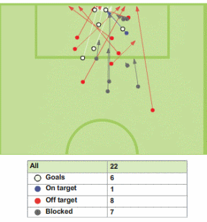
Shots on and off target for one team in a football match

Getting Started
Try to identify who might be interested in each graph. Then put yourself in their shoes and imagine how they might want to use the data.
This problem follows on from Charting Success, so you could take a look at the solution to give you an idea of the sort of information that can be deduced from similar charts.
Student Solutions
Alexander, from Wilson's School, was the only one to submit a solution this time round! Here's what he thought of our graphs:
The first diagram portrays a lot of information:
- Most of the shots made into the hoop were closer to the hoop than the misses.
- Also, more of the shots were made from the left hand side of the hoop, and most of the baskets scored were also made from the left hand side, with only four shots made from the right side, all of which were misses.
- Out of the seventeen shots made in total, only three managed to go through the hoop.
This shows that the team got less than a fifth of their shots in so they have to practise shooting, especially from the right side.
The second diagram also shows me a lot:
- The highest score ever made for first place was in 1988, where the winner received by far the highest score, 7300.
- It also tells me that in 1984, the first three positions where very closely tied.
- Coincidently, the lowest score that was made by somebody in first position was at the same event, where all the scores were very close.
- In other years, first position scores were considerably better than second place scores.
- Also, in the first of the years charted, most of the position's lowest scores were made that year.
- The most separated positions have been the first and second. The 5th to 10th positions often come in quite close to each other point-wise.
In this final picture:
- It seems that, almost every shot the team gets on target, scores if it is not blocked.
- The team scored six goals, all of which were on target, and eight (1 on target and 7 blocked) other shots that they got on target they did not score. So therefore they managed to score 6/14 of their shots that were on target.
- The team scored a total of 6/22 shots and got a total of 14/22 shots on target and eight out of 22 shots were off target.
This means they need to work a bit on their shooting skills as they do not seem to score a lot of goals compared to the ones that they missed. This team should practise shooting towards the goal in a way that won't get blocked.
Fantastic work - thanks, Alexander!
An anonymous student on our blog made the comment:
The lines are misleading: they don't represent countries at all! They represent "1st place", "2nd place" etc. If the lines were countries the graph would be more useful.
What do you think?
Teachers' Resources
Using NRICH Tasks Richly describes ways in which teachers and learners can work with NRICH tasks in the classroom.
Why do this problem?
This problem explores the same themes and follows on from Charting Success.
When processing and representing data, it is important to consider the audience and purpose of the representation. In this problem, students are invited to consider some examples of representations from the world of sport, to make sense of the stories they tell, and to analyse whether the right representation has been chosen for the purpose.
Possible approach
Hand out this worksheet with the diagrams from the problem.
"For each graph or diagram you have been given, try to tell the story about the sporting event it represents or the information it conveys. Then have a go at answering the questions."
As the class are working, circulate and listen out for particularly insightful and detailed descriptions of the sporting events or clear analysis of the advantages and disadvantages of particular representations.
Bring the class together, and for each graph or diagram ask those students who worked on it to tell the story and share their answers to the questions. The graphs are available to display as a PowerPoint presentation here.
Key questions
How much information can you extract from each diagram?
Is there a story to be told?
Possible extension
Invite students to search for other examples of graphs or diagrams used in sport, or in wider contexts, and ask them to prepare a short presentation on why particular representations are suitable or unsuitable for different purposes. (Newspapers are a great source of both good and bad representations of data.)
Possible support
Choose one of the graphs to go through together in the class, and model the sort of response each question requires.
