Charting Success
Can you make sense of the charts and diagrams that are created and used by sports competitors, trainers and statisticians?
Problem
Some say every picture tells a story... and that a picture is worth a thousand words...
Below are some graphs, charts and diagrams created by sports statisticians, trainers or competitors to help them to analyse performance, inform training programmes or improve motivation.
For each diagram, we have posed some questions to consider.
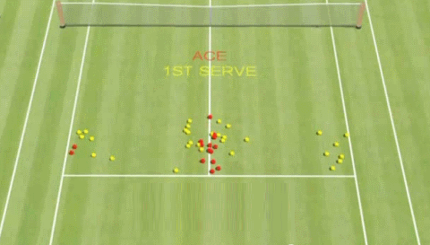
Scatter plot showing Federer's first serve landing points

- Where did Federer score the most aces?
- Where would be the best place to stand to return the serve?
- What other information would be useful to have on this plot?
- What is the likelihood that Federer will score an ace?
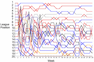
League positions of teams in a football league during a season

- Why is there so much variance in position early in the league?
- How could this chart be made clearer?
- Which team changed position the most? How could you measure this?
- Which team changed position the least?
"Heat map" showing the position of players in one team in a football match

Image courtesy of Opta
- Was this team playing up or down the pitch?
- Did this team spend more time attacking or defending?
- Where was much of the action of the game focused?
- What formation was this team using in this match?
- What strategy do you think the team was using in this game?
- What strategy do you think the opposing team might have been using?
- What do you think an ideal heat map would look like for the attacking team?
Finishing scores of the top ten athletes in Olympic heptathlon

- Which positions tend to be grouped together, and which are spread out?
- Which year had the highest performing winner?
- Which year had the closest competition?
- Imagine you were competing in this event, what score would you need to achieve in order to win a medal?
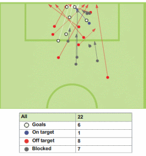
Shots on and off target for one team in a football match

- How accurate would you say the attacking team was?
- How effective was the defending team in preventing goals?
- If you were attacking, which side of the goal would you aim for?
- How does the chance of scoring a goal change with the distance from the goal?
EXTENSION
Send us examples of particularly good (or bad) representations of sports data, together with your explanation of what makes them good (or bad).
Getting Started
Some of the diagrams have labelled axes - what information can you deduce from these?
Try to identify who would be interested in each graph. Then put yourself in their shoes and imagine how they might want to use the data.
Student Solutions
We had lots of submissions sharing ideas and comments about the diagrams. Thank you to everyone for sharing your thoughts with us!
Nick from Neutral Bay Public School in Australia commented on the first diagram:
Scatter plot showing Federer's first serve landing points:
Federer scored the most aces on the right side near the centre. To return the serve, you should stand a little more than a quarter of the base line from the ends. It would be useful if the plot showed where Federer stood for each serve. The chance of Federer scoring an ace was $\frac{13}{43}$ (or $30.2\%$).
The Pythagoreans from All Saints School in Dagenham analysed and commented on two of the diagrams:
Scatter plot showing Federer's first serve landing points:
The Tennis diagram shows where the ball bounced, you can see that the tennis player did well but it doesn't show the speed the served ball was travelling at. The bounced balls could also be labeled better (e.g make the graph bigger and maybe add a few colours to the bounces that were close to each other).
It could also show serves that went out, because we don't know what percentage of serves were out.
League positions of teams in a football league during a season:
We do not like this graph! It is all over the place. The colours of the lines are confusing: when the lines intersect you can't see where they carry on because the colours are too similar. There is no key so we don't know which colour represents which team. There is too much information on the graph and so it is not clear. To improve it they could have separated the graph into a top half of the table and the bottom half, or a top six (European places) and bottom three (relegation zone).
Hattie and Daizee from Gisborne Intermediate in New Zealand shared their thoughts on four of the diagrams:
Scatter plot showing Federer's first serve landing points:
Federer scored the most aces in the middle. So the best place to return the serve would also be in the middle. It would help to know where Federer was standing for each serve.
"Heat map" showing the position of players in one team in a football match:
The team was playing up the pitch, We think the team spent more time attacking as much of the action of the game took place at the upper end of the pitch. The team's formation seemed to be spread out in the lower half of the pitch and in groups in the upper half. The team's strategy seemed to be to work on their defence, while we think the opposing team focused on spreading out.
Finishing scores of the top ten athletes in Olympic heptathlon:
The 4th to 10th positions tend to be grouped together, whereas 1st to 3rd tend to be quite separate. The highest performing winner was in 1988, while the closest competetition was in 2008. To win a medal in this event, we think you would need to get a score of about 6800.
Shots on and off target for one team in a football match:
We felt that the attacking team wasn't very accurate and the defending team was moderately effective at stopping goals since there were about as many goals as there were blocked shots. If we were attacking, we would aim for the left side of the goal because most of the goals were scored on that side. We feel that the chance of scoring a goal decreases as the distance from the goal increases because defenders have more time to intercept the ball.
Teachers' Resources
Using NRICH Tasks Richly describes ways in which teachers and learners can work with NRICH tasks in the classroom.
Why do this problem?
When processing and representing data, it is important to consider the audience and purpose of the representation. In this problem, students are invited to consider some examples of representations from the world of sport, to make sense of the stories they tell, and to analyse whether the right representation has been chosen for the purpose.
Possible approach
Hand out this worksheet with the graphs and their questions to each pair of students. You may wish to give each pair of students only some of the graphs to work on.
"For each graph or diagram you have been given, try to tell the story about the sporting event it represents or the information it conveys. Then have a go at answering the questions on the sheet."
As the class are working, circulate and listen out for particularly insightful and detailed descriptions of the sporting events or clear analysis of the advantages and disadvantages of particular representations.
Bring the class together, and for each graph or diagram ask those students who worked on it to tell the story and share their answers to the questions. The graphs and their questions are available to display as a powerpoint here.
Key questions
What are the advantages of each representation?
What are the disadvantages?
Possible extension
Invite students to search for other examples of graphs or diagrams used in sport, or in wider contexts, and ask them to prepare a short presentation on why particular representations are suitable or unsuitable for different purposes. (Newspapers are a great source of both good and bad representations of data.)
Charting More Success offers further diagrams to discuss.
Possible support
Choose one of the graphs to go through together in the class, and model the sort of response each question requires.
