What's That Graph?
Can you work out which processes are represented by the graphs?
Problem
What's That Graph? printable sheet - graphs
What's That Graph? printable sheet - processes and equations
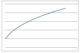
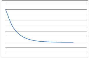
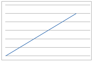
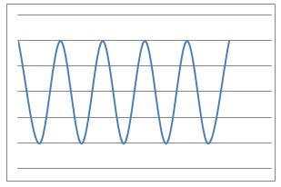
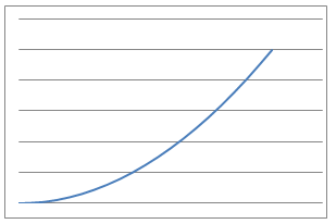
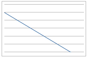
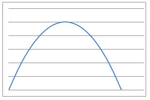
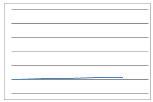
Here are some graphs of physical processes.
Image
| Image
|
Image
| Image
|
Image
| Image
|
Image
| Image
|
Can you suggest plausible processes that could have given rise to each graph?
Now click below to see eight processes that give rise to the graphs.
Can you match each process to a graph?
- A cup of tea is made and the temperature measured in degrees Celsius every second. What would the temperature - time graph look like?
- The height of the valve on a bicycle tyre above the ground is measured after each centimetre that the bicycle travels forwards. What would the height - distance graph look like?
- I throw a tennis ball straight up into the air and catch it. The height of the ball from the ground is measured over the time of the journey using freeze-frame photography. What would the height - time graph look like?
- I measure several objects using inches and then using metres, plot them on a scatter graph, and join the points. What would the metres - inches graph look like?
- I jump out of a plane and the distance fallen from the plane is measured every $0.1$ second until I open my parachute. What would the distance fallen - time graph look like whilst in freefall?
- I drive at 70 miles an hour along the motorway and note the reading on my odometer (mile counter) every 5 minutes. What would the odometer reading - time graph look like?
- I blow up a roughly spherical balloon using a balloon pump. After each pump I measure the radius of the balloon in centimetres. What would the radius - number of pumps graph look like?
- I suck water through a straw out of a large beaker at a constant rate and measure the volume of liquid remaining at various times. What would the volume-time graph look like?
Can you suggest equations that could model each of these processes?
Now click below to see eight equations.
Can you match each equation to the graphs and related processes?
| $$y=A \sqrt[3]{x}$$ | $$y = A \sin(Bx)+A$$ | $$y = Ax + B$$ | $$y=\frac{A}{e^x}+B$$ |
| $$y=Ax^2$$ | $$y = Ax^2 + Bx + C$$ | $$y = Ax$$ | $$y = Ax+B$$ |
Extension
Can you determine values for the constants A, B and C for each equation? For some, you will need to make some assumptions.
Getting Started
A 'temperature-time' graph has temperature on the vertical (y) axis and time on the horizontal (x) axis.
What would the temperature be after a short time has passed?
What would happen to the temperature as time passes?
A 'height-distance' graph has height on the vertical axis and distance on the horizontal axis...
Student Solutions
Rishik K started from the eight processes, and matched each one to an equation and type of graph. In some cases, Rishik also suggested what the numbers A, B and C could be. Here is Rishik's work:
A cup of tea is made and the temperature measured in degrees Celsius every second. What would the temperature - time graph look like?
$$y = \frac{A}{e^x}+B$$
Image
The height of the valve on a bicycle tyre above the ground is measured after each centimetre that the bicycle travels forwards. What would the height - distance graph look like?
$$y=A\sin {Bx} +A$$
Image
A=12
If $A=12$ then the highest point above the ground that the valve reaches is 24 centimetres. That means the bicycle has very small wheels!
I throw a tennis ball straight up into the air and catch it. The height of the ball from the ground is measured over the time of the journey using freeze-frame photography. What would the height - time graph look like?
$$y=Ax^2$$
Image
A has to be a negative number.
I measure several objects using inches and then using metres, plot them on a scatter graph, and join the points. What would the metres - inches graph look like?
$$y=Ax$$
Image
A definitely has to be more than 0.
I jump out of a plane and the distance fallen from the plane is measured every $0.1$ second until I open my parachute. What would the distance fallen - time graph look like whilst in freefall?
$$y=Ax^2+Bx+C$$
Image
A must be more than 0. If A was negative, it would instead be an upside-down parabola. I think B and C may be 0.
I drive at 70 miles an hour along the motorway and note the reading on my odometer (mile counter) every 5 minutes. What would the odometer reading - time graph look like?
$$y=Ax+B$$
Image
A is an incredibly small positive fraction and B is 1 because the line has a y intercept at (0,1)
It looks like this conclusion comes from looking at the graph - but it's important to think about the real-life process as well, especially since we don't know the scale on the graph. Is it possible that the graph here could be swapped with the graph for process 4 (measuring objects in inches and in metres)?
I blow up a roughly spherical balloon using a balloon pump. After each pump I measure the radius of the balloon in centimetres. What would the radius - number of pumps graph look like?
$$y=\sqrt[3]{x}$$
Image
I suck water through a straw out of a large beaker at a constant rate and measure the volume of liquid remaining at various times. What would the volume-time graph look like?
$$y=Ax+B$$
Image
A is negative and B is 5 because the line crosses the y axis at (0,5).
Again, remember that the graph scale is not given, so the value of the intercept cannot be read from the graph.We also do not know which line represents the x- or y- axis.
Teachers' Resources
Using NRICH Tasks Richly describes ways in which teachers and learners can work with NRICH tasks in the classroom.
Why do this problem?
This problem offers students the chance to explore functions and graphs in real-life contexts. There is an opportunity for students to use their scientific understanding as they are invited to suggest plausible processes for each graph.
Possible approach
Hand out this worksheet with copies of the eight graphs, and ask students to discuss in pairs what physical processes they could represent. Make it clear that there are a lot of possible answers:
After students have had time to come up with processes for each graph, invite them to share their suggested processes and justifications. Encourage the class to be critical of the suggestions.
Next, reveal that the graphs were actually generated from the processes listed on this worksheet. Hand out the worksheet, and ask students to work in pairs to match the processes (and equations if appropriate) to the graphs.
To ensure that students think critically about matching the processes to the graphs, students could be required to present their solutions on a poster with each graph and process (and equation if appropriate) accompanied by a short sentence explaining WHY they match.
Key questions
What are the key features of each graph?
Where might the axes be placed on the graphs? What scale might you put on the axes?
Possible support
Start by giving students the processes and ask them to discuss and sketch what the graphs might look like first. Clarify the appropriate labels for each of the axes.
Possible extension
Ask students to suggest realistic values for the constants A, B and C in the equations of the graphs.
