Charting Success


Some say every picture tells a story... and that a picture is worth a thousand words...
Below are some graphs, charts and diagrams created by sports statisticians, trainers or competitors to help them to analyse performance, inform training programmes or improve motivation.
For each diagram, we have posed some questions to consider.
Scatter plot showing Federer's first serve landing points
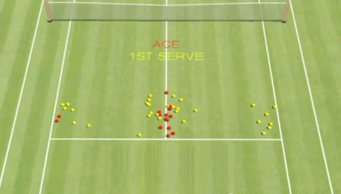
- Where did Federer score the most aces?
- Where would be the best place to stand to return the serve?
- What other information would be useful to have on this plot?
- What is the likelihood that Federer will score an ace?
League positions of teams in a football league during a season
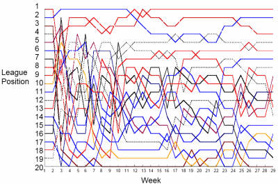
- Why is there so much variance in position early in the league?
- How could this chart be made clearer?
- Which team changed position the most? How could you measure this?
- Which team changed position the least?
"Heat map" showing the position of players in one team in a football match
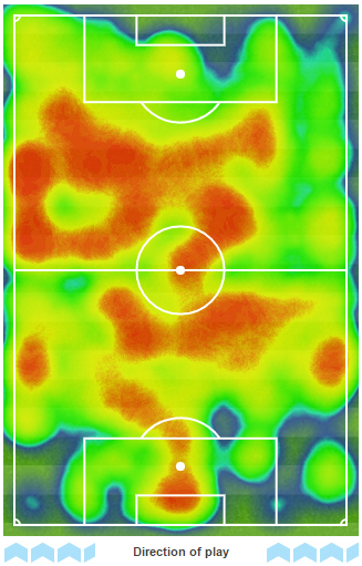
Image courtesy of Opta
- Was this team playing up or down the pitch?
- Did this team spend more time attacking or defending?
- Where was much of the action of the game focused?
- What formation was this team using in this match?
- What strategy do you think the team was using in this game?
- What strategy do you think the opposing team might have been using?
- What do you think an ideal heat map would look like for the attacking team?
Finishing scores of the top ten athletes in Olympic heptathlon
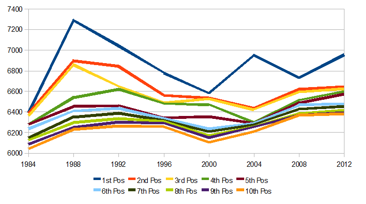
- Which positions tend to be grouped together, and which are spread out?
- Which year had the highest performing winner?
- Which year had the closest competition?
- Imagine you were competing in this event, what score would you need to achieve in order to win a medal?
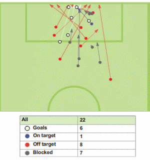
- How accurate would you say the attacking team was?
- How effective was the defending team in preventing goals?
- If you were attacking, which side of the goal would you aim for?
- How does the chance of scoring a goal change with the distance from the goal?
EXTENSION
Send us examples of particularly good (or bad) representations of sports data, together with your explanation of what makes them good (or bad).