Graphic Biology
Several graphs of the sort occurring commonly in biology are given.
How many processes can you map to each graph?
Problem
Image

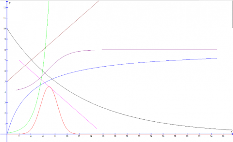
The graph above has several plots representing biological processes. Can you assign as many possible solutions to each of these plots?
Can you model each one as a mathematical function?
What units and labels would be appropriate for each of the axes, considering each plot in turn?
Student Solutions
There are many possible processes that display plots matching the graphs given. This part of the question was designed in order to get you to think about a wide variety of biological examples. Here we will mention a few that satisfy each of the plotted relationships. There is much potential in terms of the possible units that could be used for the axes.
Red- this relationship could be followed if the rate of reaction for an enzyme catalysed reaction was plotted against the pH as certain groups may require deprotonation, changing the structure of the protein to make a functional active site. Too high a pH may cause deprontonation at other residues, altering protein structure in a way that reduces the rate of reaction.
Green- plotting the amount of DNA produced against time for a PCR would give a plot similar to this. Exponential increase in the number of DNA strands occurs with every cycle as the amount of DNA is doubled through replication. The amount of DNA doubles with each cycle, so x in the case of this plot would be the time take for a single cycle of PCR to complete.
Blue- plotting the initial rate of an enzyme catalysed reaction against substrate concentration would yield the following relationship. A maximum is reached when the active sites of all enzymes in solution become saturated with substrate meaning that there is no additional increase in rate of reaction on addition of more substrate. A plot of something like concentration of CO$_2$ against the rate of photosynthesis, possibly measured by evolution of O$_2$ over time, would yield a similar plot where a maximum rate is reached as the concentration of CO$_2$ is no longer a limiting factor to the rate of photosynthesis (for example light intensity may be too low a level for any additional CO$_2$ to be processed above a certain level.
Purple-a pH curve for a titration follows a similar shape to one of these graphs as an interesting point. The activity of lysozyme against pH (in a large excess of substrate) is a interesting biological example that follows this trend as the deprotonation of a certain residue is all that is required to cause the activation of lysozyme. If we plot the percentage saturation of haemoglobin against the partial pressure of oxygen also produces a similar sigmoidal curve due to the binding affinity of oxygen being co-operative i.e. binding of an oxygen molecule causes the affinity of the haemoglobin molecule for further oxygen diatoms to increase until steric effects and tendency for dissociation hinder the binding of a potential 4$$^{\text{th}}$ molecule.
Brown- a traditional linear plot is of course very common. An example could be volume of blood flow past a point against time at a major vessel in a circulatory system. Rate of reaction against concentration of a reactant may be linear if all other reactants are in excess. A common experiment involving the placement of a potato cylinder in solutions of varying concentration follows a linear trend if percentage change in mass is plotted against the degree of dilution of the surrounding solution, around the isotonic point.
Pink- this plot is again highly common. If we plot something like log (distance migrated) on the y axis against the molecular weight of a fragment of DNA placed under gel electrophoresis, we get this type of curve.
Black- an exponential decay relationship could be, for example, a plot of concentration of ibuprofen in the blood over time after the peak dose has been recorded. The concentration of adrenalin over time could operate in a similar way over defined time scales.
In order of intercept with the y-axis, the curves may be represented by the following functions:
Red- an alteration of the equation for the probability density function of a normal distribution
$$f(x) = \frac{a}{\sqrt{2\pi}}e^{-\frac{(x + b)^2}{c}}$$
Green- exponential increase
$$f(x) = a(2)^{\frac{x}{b}}$$
Blue- diminishing gradient and reaching a maximum
$$f(x) = \frac{ax}{x + b}$$
Purple- S-shaped profile with a rapid increase in gradient which diminishes to reach a maximum
$$f(x) = a tanh(bx + c) + d$$
Brown- linear plot showing a proportional increase in f(x) with an increase in x
$$f(x) = ax + b$$
Pink- linear plot showing a proportional decrease in f(x) with an increase in x
$$f(x) = -ax + b$$
Black- exponential decay
$$f(x) = a{(\frac{1}{2})}^{\frac{x}{b}}$$
Consider what effect changing the values of the constants would have on the form and placement of the graphs given.
