Back Fitter
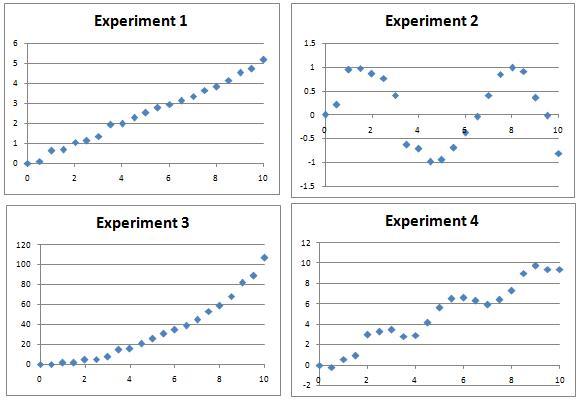
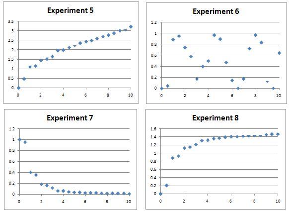
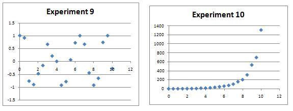
10 graphs of experimental data are given. Can you use a spreadsheet to find algebraic graphs which match them closely, and thus discover the formulae most likely to govern the underlying processes?
Problem
Several experiments were performed and data measured over a period of 10 hours.
The resulting charts are shown below.
Can you find algebraic equations which closely match the curves, which could be used to predict values of the variables at other times? There might be many possible curves of the right sort of shape by eye, so a numerical plot will be needed to discover the most likely candidates.
This spreadsheet will allow you easily to compare plots of the likely curves against the actual data - the intention is that you will tackle this problem numerically.
Note: The different sets of experimental data are distinct, so try as many or as few as you like. Fitting all of the sets will present quite a challenge!


Extension: Whilst you might think there are 'obvious' candidates for each data set, can you find multiple functions which give apparently good matches to some of the data sets? How might you numerically determine which fits are best?
Getting Started
Start by looking for data which can be matched to straightforward functions like a straight line, or a quadratic.
Which data sets oscillate? What functions do you know which oscillate?
If you are unfamiliar with the graphs of $y=a^x$ and $y=a^{-x}$ for different values of the constant $a$, try plotting them using graphing software or a graphical calculator.
Student Solutions
After a while spent as a toughnut, we recieved the solution to this problem. We were very pleased to see that one of our younger solvers, Jonathan, realised that the first graph was $y=0.5 x$. Impressively, a full solution was sent in by James from Bay House, where all of his functions gave a close fit with the data -- well done James!
James' suggestions agreed with ours in six of the cases (bold font), but differed in four cases (normal font). Perhaps you might like to consider what other functions fit the data for these experiments.
Experiment 1: $y=x/2$
Experiment 2: $y=\sin(x) $
Experiment 3: $y=x^2$
Experiment 4: $y=x-\sin(2x)$
Experiment 5: $y=5\log_{45}(x+1)$ $\left(\mbox{we got }y=\sqrt{x}\right)$
Experiment 6: $y=(\sin(1.7x)+1)/2$ $\left(\mbox{we got }y=\sin^2(x)\right)$
Experiment 7: $y=-0.6+(\log_{10}(6x))^{-1}$ $\left(\mbox{we got }y=\frac{1}{1+x^2}\right)$
Experiment 8: $y=\log_{15}(7x+1)$ $\left(\mbox{we got }y=1.65x/(1+x)\right)$
Experiment 9: $y=\cos(2x)$
Experiment 10: $y=2^x$
Teachers' Resources
Using NRICH Tasks Richly describes ways in which teachers and learners can work with NRICH tasks in the classroom.
Why do this problem?
This problem offers an opportunity to reflect on the very important concept of fitting a curve to experimental data. Along the way, students will utilise their skills of transforming graphs in order to find a close fit, and consider ways of deciding how close their fit is. The problem may be straightforward to begin, but finding a complete solution for all 10 graphs may be rather more challenging!
Possible approach
Although this problem stands alone, it could also be done as a follow-up to work on transformations of graphs based on the problem Parabolic Patterns.
Students will need access to computers, tablets or graphical calculators to get the best out of this task. Familiarity with spreadsheet software is assumed.
Part of the challenge of this problem is to identify which graphs are easiest to fit, as they are not presented in any particular order.
One approach is to start by displaying the graphs and discussing as a class or in pairs which have recognisable shapes, such as straight lines, quadratics, trig graphs and exponential graphs.
If students haven't met graphs such as $y=a^x$ and $y=a^{-x}$ it might be fruitful to give them some time to experiment with graphical calculators to see what these graphs look like for different values of the constant $a.$
Once students have some preliminary ideas about graphs which might fit, small groups could start to work on the spreadsheet, entering a possible equation and seeing how closely it matches the given data. (If necessary, remind students that they can add an equation for one cell and drag the fill handle down to fill all the cells for that experiment.) After adding one equation and seeing how it fits the experiment data, they could use their knowledge of transformations of graphs to tweak their equation to get a closer match. If the groups cannot use the spreadsheet, they could use graphical calculators or graphing software such as GeoGebra or Desmos to find graphs with the right shape.
Ask each group to agree on what they think is the best equation for each graph, so they may need to convince each other that their equation is a good fit.
After students have had time to choose equations for some or most of the graphs, ask the whole class to come together to choose what they think are the best equations. Ideally, different groups will come up with slightly different suggestions for functions, and this can stimulate discussion about how to decide which function most closely matches the data. Each group could argue the case for their equation, and the class could decide together which is the best fit.
Key questions
What clues can you find from the axes and the points given to help you guess a likely function?
Possible support
Graphs 1, 3 and 5 are the most straightforward functions to fit, so this is a good place to start.
Possible extension
Students could investigate and discuss the benefits of a least squares method of determining how close the fit is.
